

Website re-design
CitiBusiness Online
We reimagined the CitiBusiness Online digital customer experience through iterative user research, prototyping, and responsive web development.
Tools used Zeplin & Sketch
Duration 1 year
My role UI Design from wireframe to development, client engagement with design

Step 1
What are we doing?
Along with Citi stakeholders, we met to understand the problems and complexity of the platform.
Our team consisted of:
1 Product manager
1 Strategist
1 Lead product designer
1 Product designer (me)
4 Developers
2 Testers
We were brought in to not only bring an updated UI but for the first time incorporate human-centered design practices into the product’s life. Because most of the features were just added on as additional links when they were created, we began interviewing their customers to identify the most common workflows, product personas, and Jobs to Be Done within the site. Using that feedback, we facilitated a 2-day innovation session with Citi to take a look at the feedback and see - given technical and legal restraints - where we were able to make improvements with clicks and information hierarchy.
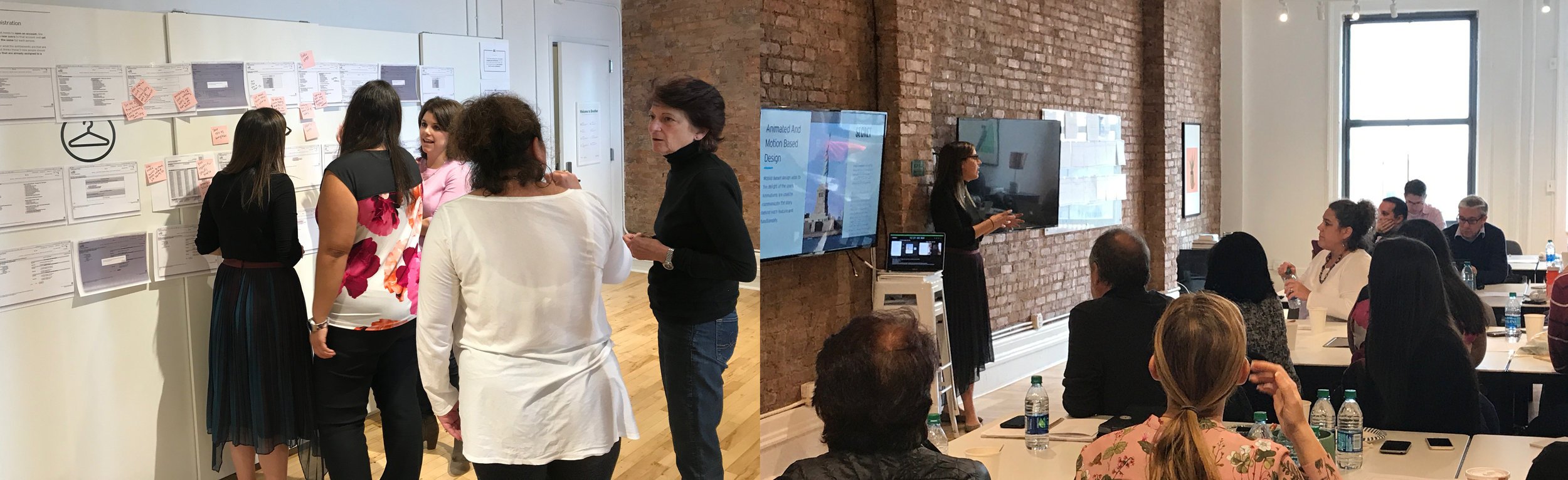
The photos below are shots from an interactive journey mapping session we ran with smaller groups of stakeholders, and the team presenting a deck of UX trends to not only educate the group (who was fairly new to design thinking) on where the industry currently was but the ways in which we were hoping to leverage Citi’s brand and trust with their clients to push their UX beyond the competition.
Step 2
Let’s get to designing
Where do we start redesigning a 20-year-old platform?
Before starting we carried out intense discovery research with the Citi developers that had worked on the platform from its conception. They knew all the functionality in and out and were able to give us the scoop on the information architecture of the site.
The platform was so big we started having daily sessions with that dev team so they could walk us through a certain feature, screen by screen. During these sessions, we had the chance to ask as many questions as we wanted about how they got to that point and why the decisions were made.


Initial designs from the sessions I mentioned above were used to begin the first of about 8, 3-week sprints, using continued validation and iterative design to evolve the interface. Each additional feature was groomed, wireframed, prototyped, tested with Citi users, iterated, and brought into high fidelity every sprint, producing the Phase 1 release of the product.


Step 3
Handover
Part of the challenge in this project was how to make these new designs easily accessible to a development team that had been working on this 20-year platform practically since the beginning.
We couldn’t just hand over screenshots and specs via Zeplin because the learning curve for a new tool was outside the scope of the project. And we also didn’t finish the site in its entirety. CitiBusiness Online is a very complex platform, in order to finish the redesign completely we would’ve had to be involved in it for 2+ extra years, and as you can probably guess, that was also out of scope.
So we had to deliver something that would be easy to digest for a development team set in their ways, but that would be detailed enough that whoever picks up the project after we left would be able to continue the excellent work.
We settled on delivering a style guide PDF following Citi’s internal brand guidelines and regulations so that it could be shared around internally without problems.


