

Branding project
Mythbridge
“Outside the boundaries of the universes lie the raw realities, the could-have-beens, the might-bes, the never-weres, the wild ideas, all being created and uncreated chaotically like elements in fermenting supernovas.”
- Terry Pratchett, Moving Pictures
Mythbridge came upon as the collision of human imagination and storytelling. Just like all roads lead to Rome, all Myths lead to Mythbridge. More than a comic book it’s a satirical fantasy world filled with characters of all sorts and shapes, mostly flawed yet intriguing in their own ways.


When we started this project, we knew a few things for sure:
This is a 50s-style fantastical world
It’s heavily inspired by mystery/thriller stories
It has to convey a different range of genres of fantasy characters
It has to be FUN
So we went all in, an tried a million different styles.
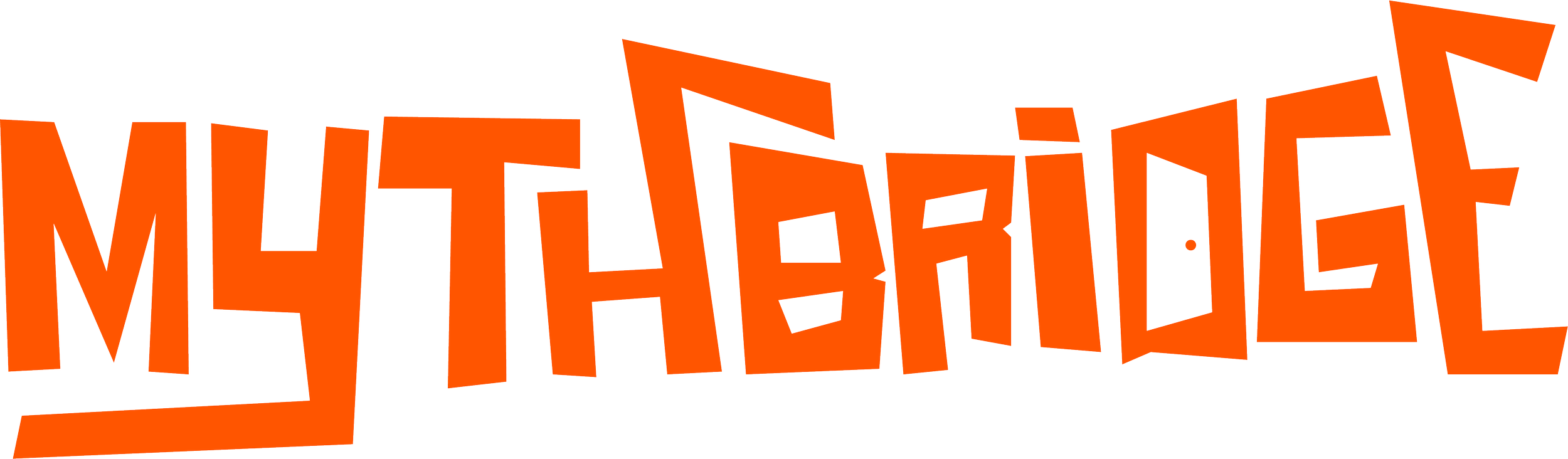
We ended up creating a Hitchcock’s Vertigo/Saul Bass inspired font
We wanted to evoke the 50’s thriller time while also adding some playful elements (like the door on the ‘D’) that would allow us to adapt the logo to the different story lines within the Mythbridge universe.

